Get Your Business Online
With an Affordable Website!

Websites are crucial for businesses to thrive online, but high design costs can be a barrier.
Without access to quality web design services, businesses are unable to stand out from their competition.
That’s where we come in. Our affordable web design services provide quality solutions that fit your budget.
We offer low-cost designs with the same high level of excellence as more expensive options, so you can compete online without breaking the bank.
Some of our most exciting website design creations.
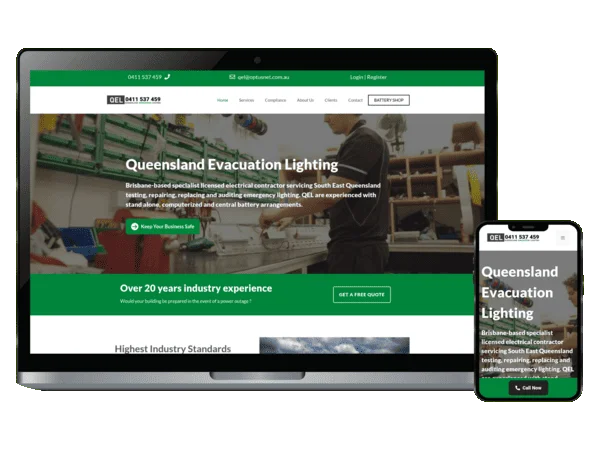
Evacuation Lighting
1st on Google
For “milton emergency lighting”
“Great service, Chris has loads of experience and really know his stuff, we expanded our business for selling batteries online”
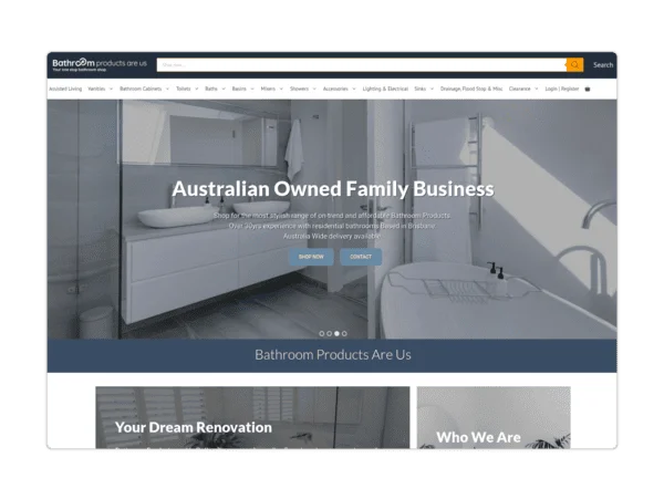
Bathroom Products
1st on Google
For “australian bathroom products”
“Chris have been a great help with our online website at Bathroom Products Are Us for a number of years. So, if you need anything regarding website, he is the man to help.”
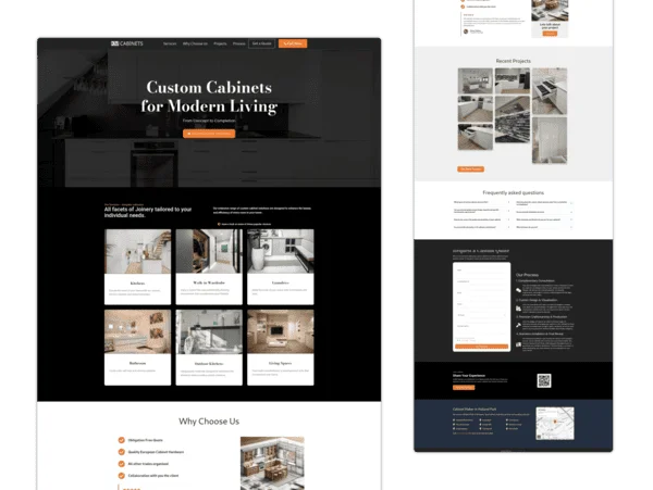
Cabinet Maker
1st on Google
For “cabinet maker holland park”
“Chris built a stylish website for us and he did well to put up with how fussy I am.”
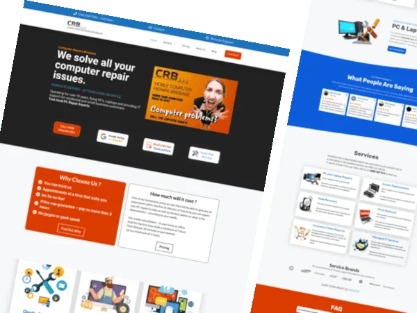
Computer Repairs
1st on Google
For “computer repairs brisbane”
“Was blown out by the designs Chris showed me, so glad I found this site/ Easy to communicate and instinctive about my needs. Would not hesitate to recommend.”
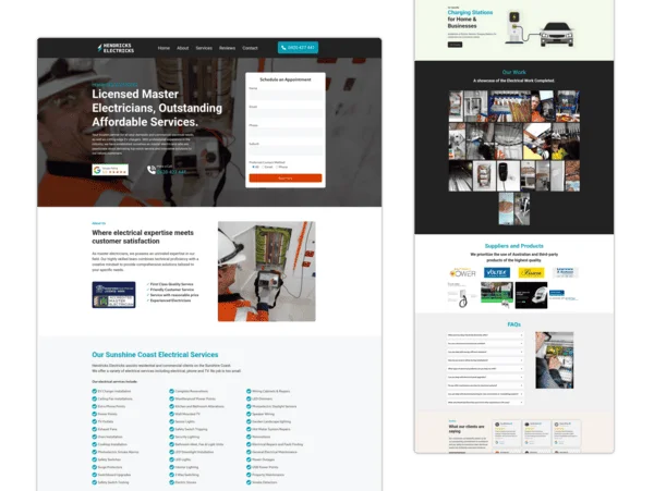
Electrician
1st on Google
For “hendricks electricks”
“I knew nothing about site rating and all that other stuff you incorporated into our deal, plus your quote was exceptional compared with a few others we received. Brilliant experience for the biz, money well spent.”
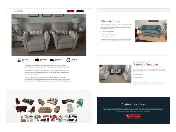
Furniture Upholstery
1st on Google
For “upholstery ipswich”
“Our experience with Chris has been very positive. Very knowledgeable and creative. He has gone out of his way to make our website something special. Thanks again Chris.”
What People Are Saying
Meet our clients and find out why our Services are the preferred choice.

GROW TRAFFIC & INCREASE REVENUE
Appear On the Front Page of Google
We offer professional SEO services that help websites increase their organic search score drastically in order to compete for the highest rankings — even when it comes to highly competitive keywords.
IT Services
Establish your online presence with a professional website.
Get ongoing website management and support. You’ll never have to worry about your website again.

Responsive & Mobile Friendly
Websites are 100% responsive meaning they work on mobile, tablets & desktop computers.

Professional Management
Setting up your domain name, web hosting, security, e-mail, backups, managing and maintaining services and more!

Full-Service Website Design
What are your website goals? Do you want to create leads, sell products, manage your customers, or manage your business? Your website can do much more for you.

Support and Training
Ensuring fast response times and responding quickly to issues and providing training for users to effective to complete simple and advanced tasks.
Mobile Friendly Websites
An unresponsive website can cause immense frustration to visitors, lead to poor user experience and cost your business potential customers.
An outdated website design is like telling potential clients you don’t care about their experience – it’s the fastest way to lose customers and weaken your brand.
Get a modern, attention grabbing website that will help you stand out from the crowd and make a lasting impression.
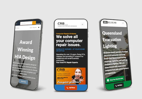
Communicates With Your Target Audience

Web Design
The role of a website is to attract and engage the user, as well as communicate your brand and raise awareness about a product or service.

SEO
SEO offers a visible and effective search presence leading to a considerable increase of sales, profitability, and cost efficiency.

Support
Give us a call or drop by anytime, we endeavour to answer all enquiries within 24 hours on business days. We will be happy to answer your questions.
FAQs
What services do you offer?
We offer a wide range of services including website design and development, eCommerce solutions, website maintenance, search engine optimization, social media marketing, and graphic design.
How much does a website cost?
The cost of a website varies depending on several factors such as the complexity of the design, the number of pages, and the features required. We offer transparent pricing and will work with you to develop a customized solution that meets your needs and budget.
How long does it take to build a website?
The timeline for building a website varies depending on the scope of the project. A basic website can be completed in as little as two weeks, while more complex projects may take several months. We will provide you with a timeline and work with you to ensure that your project is completed on schedule.
Do you provide ongoing website maintenance and support?
Yes, we offer ongoing website maintenance and support services to ensure that your website is always up-to-date and secure. Our support team is available to answer any questions you may have and provide technical assistance when needed.
Will my website be optimized for search engines?
Yes, we provide search engine optimization services to ensure that your website is visible and easily found by search engines. We will work with you to develop a customized strategy that includes keyword research, on-page optimization, and link building.
Can you help me with social media marketing?
Yes, we offer social media marketing services to help you engage with your target audience and drive traffic to your website. We can help you develop a social media strategy, create engaging content, and manage your social media accounts.
How do I get started?
Getting started is easy! Simply contact us and we will schedule a consultation to discuss your needs and develop a customized solution for your business. We look forward to working with you!

Pricing
We are highly motivated towards designing strategies that deliver measurable business impact. So that you get the most out of every marketing dollar you spend.
At SuperUser Web Design, we offer a range of services, including website design, website development, eCommerce solutions, website maintenance, and search engine optimization (SEO).
The cost of our services depends on the specific needs of each client. Factors such as the complexity of the website, the number of pages, the level of customization, and the amount of content will all affect the final cost.
However, to give you a general idea of our pricing, here are some estimated ranges:
- Website design: $600 – $3,000
- Website development: $600 – $3,000
- eCommerce solutions: $1,000 – $3,000
- Website maintenance: $60 – $300 per month
- Search engine optimization (SEO): $500 – $1,000 per month
Please note that these are estimated ranges, and the final cost will depend on the specific needs and requirements of each client. We offer customized pricing plans tailored to meet the unique needs and budget of each business.
We believe in transparency and providing our clients with a clear understanding of our pricing structure. Contact us today to get a customized quote for your specific web design and SEO needs.

* No lock in, cancel any time
Contact Us
Want to hire the best people around to design, develop, and turn your project into reality? Well look no further! Take your business to the next level.
It costs nothing to talk.


